

HEROIC launches new rebrand
published 25 January 2023
New logo, new look, new HEROIC.
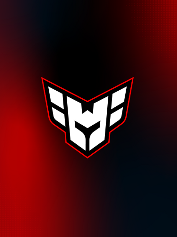
The H shaped valkyrie helmet has been HEROIC`s logomark since 2019. Now it takes a new shape for 2023.
HEROIC struggled with their rectangular logo always being smaller and harder to read than our competitors. This problem has been solved by making the logo more square shaped, with shorter and sharper wings, and a more defined helmet with cleaner lines.
The helmet´s bright, white color represents the nobleness and purity of heroes, with the flaming red outline unifies the power of heart, heat and thunder.
While red is still the main defining color of HEROIC. The expanded color palette will contribute to make HEROIC a more diverse and playful brand.
The new wordmark is designed to compliment the new logo, with a sharp cut in the H representing the wings.
Going forward, HEROIC will be hotter, bolder and louder. We will bring heart, heat and thunder in everything we do.
For more in depth infomation about the HEROIC brand, read here:
heroic.gg/company/about


DIGITAL BRANDBOOK


Join our family
Create an account and get access to exclusive digital content, giveaways, product drops and much more.
SIGN UP